
TL;DR: Mobile app design patterns are reusable solutions to common UI and structural problems that appear across apps. Knowing which pattern fits which situation (tab bar vs. drawer, list vs. grid, swipe vs. button) helps you make faster, more consistent decisions when building.
Your thumb makes dozens of tiny decisions before you’ve even opened the app fully. You already know how to swipe to delete an email, pull down to refresh a feed, and tap an icon to switch tabs. You’ve done it all before, hundreds of times.
Design patterns are what make that possible. Someone figured out a good way to handle deleting something, refreshing a feed, or moving between screens, and other designers have reused that approach instead of starting over each time.
This guide walks through what these patterns are, the most important ones for navigation and content, and how to pick the right one for each screen in your app.
What are mobile app design patterns?
A mobile app design pattern is a proven way to solve a problem that comes up in almost every app, like letting someone delete a message, switch between sections, or scroll through a list. Instead of starting from scratch, you reach for a structure people already know how to use.
Patterns come in two broad families.
UI and interaction patterns define what users see and touch on screen: navigation structures, content layouts, gestures like swipe and pull-to-refresh, and feedback states like loading indicators. These matter most for day-to-day building, since they’re the tab bars, cards, and swipe actions you’ll configure when designing screens.
Architecture patterns define how your app’s code and logic are organized behind the scenes, separating data, business rules, and the user interface into distinct layers. They matter more for long-term maintainability, but most builders won’t need to touch them directly, especially if you’re building visually instead of writing code.

Why do mobile app design patterns matter?
Patterns save decision-making time. When you know the established solution to a navigation problem, you don’t spend hours debating it from scratch. Instead, you focus on the specific details that make your app unique.
New users bring expectations from every other app they’ve used, so following familiar patterns lets them focus on your content instead of relearning how to navigate.
Consistency matters too. A tab bar that behaves differently from screen to screen creates unnecessary friction, even within the same app. Reusing the same pattern also saves you from designing something new for every screen you add.
Architecture patterns for mobile apps
Architecture patterns are about how your app’s code is organized behind the scenes. They separate data, logic, and the user interface into distinct layers, so a change to one doesn’t ripple through the rest of the app as it grows.
A handful of well-known patterns split up the work differently. The table below breaks down four of the most common: MVC, MVP, MVVM, and Clean Architecture/VIPER.
| What it separates | Best for | Often discussed in | |
|---|---|---|---|
| MVC | Data (model), display (view), logic (controller) | Simple apps with straightforward flows | Long-established software architecture |
| MVP | Data (model), display (view), presentation logic (presenter) | Testable apps where UI and logic need clear boundaries | Some mobile architectures |
| MVVM | Data (model), display (view), prepared display data (view model) | Apps with reactive UIs that update automatically when data changes | Modern app architectures |
| Clean Architecture / VIPER | Multiple distinct layers for logic, data, UI, navigation, and entities | Apps where strict separation of concerns is important from day one | Larger and more complex codebases |
You probably won’t build these yourself. But it helps to recognize them: in a freelancer’s portfolio, in an agency’s pitch, or in Apple’s and Google’s developer docs (both of which push you toward MVVM these days).
Each pattern shares the same three pieces. The view is the endpoint: what the user sees and touches. The model is the starting point: where the data lives. The layer in between translates between them, turning raw data into something to display, and turning taps or edits back into changes to the data.
What changes between patterns is how the middle layer talks to the view. In MVC, the controller reaches in and changes the view directly. In MVP, it hands instructions through a formal interface instead. In MVVM, the relationship flips: The view watches the view model’s data on its own and updates itself. Clean Architecture and VIPER add more layers before the middle layer, rather than changing how it talks to the view.
- MVC is the fastest to set up, but the controller can end up handling too much on its own.
- MVP adds a testable boundary between the presenter and the screen, which is why teams reach for it over MVC.
- MVVM lets the view update itself automatically and pairs well with modern frameworks like SwiftUI or Jetpack Compose.
- Clean Architecture and VIPER make sense for large teams, but most solo builders don’t need that many layers this early.
UI design patterns every mobile app should use
This is where most of the day-to-day decisions live: what users see and touch on screen. Mobile UI design patterns cover how someone moves through your app and how they interact with what’s on screen.
Navigation patterns
Moving through your app usually comes down to one of four patterns: tab bar, stack navigation, modal navigation, or a navigation drawer.
- Tab bar: Icons fixed along the bottom of the screen that give quick access to your app’s main sections. It works best for a small set of 3–5 top-level destinations people switch between often, like Home, Search, Notifications, and Profile in a social app. iOS builders lean on this pattern by convention.
- Bottom navigation bar: Basically the same idea as a tab bar, associated more with Android and Google’s Material Design system. It’s great for a small set of top-level destinations. The real difference from a tab bar is the styling and platform, not how it works.
- Navigation drawer: A panel that slides in from the side, usually behind a hamburger menu. It’s good for things people reach for less often, like settings or account management. Be careful using it for anything primary, since options stay hidden until someone opens it.
- Stack navigation: Screens stack on top of each other as people go deeper, and a back button takes them out again. This is the natural fit for detail pages, checkout, or any step-by-step flow.

Content display patterns
Content display patterns organize how information appears on screen.
- List view: Items stacked in a vertical scroll, one per row. Great for text-heavy content people scan line by line, like an email inbox, a message thread, or a list of transactions.
- Grid view: Items arranged in rows and columns instead. Works well for visual content people want to compare at a glance, like photos, product catalogs, or app icons.
- Cards: Self-contained blocks that mix text, image, and action, and can show up in either a list or a grid. They’re a good fit when each item carries several pieces of information plus one main action, like a job listing with a title, company, location, and an Apply button.
- Infinite scroll: New content keeps loading as someone scrolls to the bottom, which fits social feeds and anything without a natural end. It’s not great when people need to find their place again later, so pagination is often the safer bet there.
- Pagination: Splits content into pages people click through, rather than one long scroll. Use it when someone needs to return to a specific spot, or when loading everything at once would be slow.
Gesture and interaction patterns
Mobile apps should support pull-to-refresh, swipe actions, long press, and swipe-to-navigate as their core mobile-specific gesture patterns. These gestures aren’t as visible as a button, so every one of them still needs an on-screen alternative.
- Pull-to-refresh: Pulling the screen down and letting go refreshes the content. It’s a familiar move for feeds, inboxes, and any list where new stuff shows up over time. Most apps show a spinner while the refresh happens, and many also keep a visible refresh button nearby, since not everyone discovers the pull gesture on their own.
- Swipe actions: Swiping left or right on a list item reveals actions like Delete, Archive, or Mark as Read. It’s great for quick, frequent actions. When the action is destructive (like deleting something), apps usually add a confirmation step or an undo option so it’s not permanent by accident.
- Long press: Pressing and holding brings up a context menu or enters selection mode. It’s a common way to tuck away secondary actions, but since it’s hidden by default, it works best for things people don’t need to find right away.
- Swipe to navigate: Swiping sideways moves between pages, tabs, or steps, like in onboarding flows or photo galleries. It works best alongside the platform’s own back gesture rather than against it. On iOS, for example, a swipe from the left edge already means “go back,” and people expect that to keep working.
- Tap targets and thumb zones: A tap target is the tappable area of a button or control. It needs to be at least 48 × 48 dp (about the size of a fingertip) so it’s easy to hit without missing. A thumb zone is the part of the screen your thumb can comfortably reach, usually the lower half. Important buttons belong in that zone, not stretched up at the top of a tall screen.
How to choose the right mobile app design pattern
The right pattern depends on what the screen needs to do, how often people will use it, which platform you’re building for, how much content is involved, and what happens when there’s nothing to show. A few common cases:
| Functionality needed | Recommended pattern | Depends on |
|---|---|---|
| Three to five frequently used top-level sections | Tab bar (iOS) or bottom navigation bar (Android) | Frequency, platform |
| Many sections, some rarely used | Navigation drawer | Frequency |
| Linear multi-step flow | Stack navigation | Task |
| Content-heavy app with many destinations | Combination: tab bar for primary and drawer for secondary | Content |
| Short, bounded list of items | Pagination | Content |
| Long, continuous feed | Infinite scroll | Content |
| Items with mixed text, image, and action | Cards | Content |
| Frequent action on a list item | Swipe action | Frequency |
| Secondary or power-user action | Long press | Frequency |
Feedback and state patterns your app needs
Feedback and state patterns tell people what’s happening after they take an action. For example, they show whether it worked, whether the app is still loading, or whether there’s nothing to show yet. They’re easy to leave for last, but they’re what makes an app feel finished.
- Loading state: Appears while the app fetches data or processes an action, usually as a spinner or a placeholder shape that hints at what’s coming.
- Empty state: Appears when a list, feed, or search turns up nothing. A good one explains why nothing is there and gives a clear next step, like “You haven’t added any tasks yet. Tap the plus icon to create your first one.” Without that next step, it’s a dead end.
- Error state: Appears when something goes wrong, like a failed network request, a validation error, or a server issue. Be specific about what happened and what to do next; “Something went wrong” doesn’t help anyone.
- Success confirmation: Appears after someone completes a meaningful action, like submitting a form, finishing a purchase, or sending a message. A brief toast notification (a small message that pops up and disappears on its own) or a dedicated success screen confirms it worked and sets up what happens next.
- Progress indicators: Show up in multi-step flows like onboarding, checkout, or form wizards, letting people see where they are and how much is left. A progress bar or step counter makes the end feel reachable.
- Floating action button (FAB): A circular button that sits in the lower right of the screen, marking the one primary action for that screen. Stick to one FAB per screen, and only use it when there’s a clear action people will reach for often.
How to build mobile app design patterns without code
Even something as small as a tab bar or a swipe action has traditionally meant learning iOS or Android development to build.
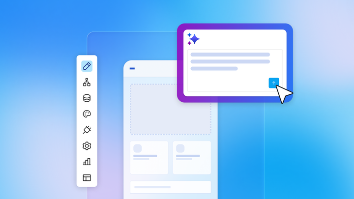
With Bubble for native mobile apps, you don’t need a background in mobile development. Describe what you want to build, and Bubble AI generates the screens, data, and logic for a real native app that shares the same backend as your Bubble web apps.
From there, the Bubble AI Agent (beta) can build and edit these patterns directly: Describe a change to a tab bar or swipe action, and it makes the update for you. When you want to make a change directly, you can always do so yourself in the visual editor. Either way, you’re never stuck in code you can’t read or maintain.
Visual workflows in Bubble show the logic behind interactions right in front of you, rather than burying that logic in code you can’t see. This way, you can always see what your app does and fix things yourself when they break.
Where you go to set each one up depends on the pattern:
- Tab items get configured in view properties
- Stack navigation runs through workflow actions
- Sheets are added as their own mobile element
- Swipe actions live on the list item template
Start building with the right patterns
This guide is here whenever you need to decide how someone should move between screens, or what a list should show when it’s empty.
When you’re ready to turn these patterns into a real app, Bubble gets you there, no native development required.
Frequently asked questions
What is the difference between an architecture pattern and a UI design pattern in mobile apps?
Architecture patterns, like MVC or MVVM, organize how your app’s code and logic work behind the scenes, keeping data, business logic, and the user interface in separate layers. UI design patterns are what users see and interact with directly: navigation, content layouts, and gestures like swipe and pull-to-refresh.
Which navigation pattern should a mobile app use — tab bar, bottom navigation, or navigation drawer?
For three to five primary destinations people switch between often, go with a tab bar (iOS) or bottom navigation bar (Android). Save the navigation drawer for secondary or less frequent destinations. And if you’ve got a lot of sections, it’s fine to use both: tab bar for your core areas, drawer for everything else.
What mobile gesture patterns should every app support?
Most apps lean on pull-to-refresh for content feeds, swipe actions for list items like archive or delete, and stack navigation’s back-swipe to move between screens. Whatever gesture you use, pair it with a visible alternative, like a button or label, so people who never discover the gesture can still get the job done.
When should a mobile app use infinite scroll vs. pagination?
Infinite scroll works well for continuous feeds where people are just browsing, like a social feed or news stream. Reach for pagination instead when people need to get back to a specific spot in a list, or when loading everything at once would slow things down.
What is an empty state in mobile app design?
An empty state is what someone sees when a list, feed, or search comes up with nothing, like an inbox with no messages or a search with no results. A good one explains why nothing’s there and gives a clear next step, turning what could be a dead end into a guided nudge forward.
Build for as long as you want on the Free plan. Only upgrade when you're ready to launch.
Join Bubble