Good design can feel hard to define, but bad design slaps us in the face.
Think about the last mobile app that you used that was really awful.
- Was it hard to use?
- Impossible to find what you needed?
- Didn’t solve your problems?
- Difficult to read on a small screen?
- Just plain ugly?
All of those problems likely stem back to poor mobile app design. That poor design ends up being the reason why users disengage and stop using your app.
So, design matters. And while good design feels intuitive to the end user, it’s not always intuitive to create. In this article: The core elements of mobile design, best practices, and how to design a mobile app — that engages and converts — step-by-step.
Understanding mobile app design
Mobile app design is a broad category — and one that’s easily conflated with web design. After all, design is design, right?
Not quite.
Although designing for web and mobile have some overlap, designing for mobile has many different considerations. Screen size on mobile is so much smaller, users navigate the app completely differently, and goals and expectations for design vary as a result.
For example, on mobile, you’ll want to integrate native components like screens and swiping. These don’t exist for web, but on mobile, people expect them — so there are some mobile-specific design considerations you’ll need to incorporate.
Before we dive into how to design your mobile app, we’ll take a quick look at some of the elements of mobile design and how it differs from other types of software design.
Why good app design matters
Great mobile app design may be even more important than good web design.
On the web, it’s often possible to still navigate and use a poorly-designed website, but on mobile, poor design can tank usability quickly. But even if your mobile app is usable, good design supports:
- User adoption: Better design = better adoption
- Intuitiveness: Reduces frustration and helps users move faster
- Engagement and retention: A well-designed app is a pleasant, even addicting experience
Good functionality without good design stunts your growth on mobile. Users who can’t easily navigate and use your app will churn, while apps with intuitive, engaging design (like TikTok, Google Maps, Spotify, Duolingo) become a seamless part of the user’s day and set UI/UX expectations that other apps have to meet.
The difference between UX and UI
Mobile design encapsulates both user experience and user interface design. However, both of these processes are worth understanding on their own.
- UX (user experience) design centers on the user’s overall experience and interaction with your app. It’s about how your app functions and the user experience, and prioritizes easy-to-use, intuitive interactions.
- UI (user interface) design focuses on the visual elements and interface of your app. It thinks more about the look and feel of your app, prioritizing visually appealing, on-brand pages and screens.
UX thinks about functionality, user flows, and experiences. How easy is the app to navigate? How quickly can a user complete a task? How intuitive is it to use? Is it fun, simple, engaging?
UI thinks about the visual layer, branding, and cohesiveness. Is the typography on brand? Do the buttons look good and make sense visually? Is the spacing consistent?
Designing across multiple platforms
There are also different design standards and guidelines for different platforms and devices. Yes, web vs. mobile is a key one. But even within mobile, there are different standards to consider based on platform and device. Here are the three primary app platforms you might design for:
| Platform | Expectations |
|---|---|
|
Mobile iOS |
Follows Apple’s Human Interface Guidelines (HIG), prioritizes clean, minimalist UI with swipe gestures. |
|
Mobile Android |
Follows Google’s Material Design, prioritizes top tabs, hamburger menus, and floating buttons for navigation. |
|
Web apps |
Accessed via a variety of browsers on multiple devices — may need to mimic mobile functionality while also behaving like websites on desktops / laptop computers. |
Whichever app platform you design for, keep responsive design in mind. Responsive design makes sure that your design is functional at different screen sizes. While this is important for web apps, even iOS and Android apps can also be used on devices and screens of very different sizes — responsive design makes sure your app works well everywhere it can be used.
If you’re thinking about cross-platform design and development, check out this primer on how to develop for web and mobile in one place on Bubble:
Core elements of mobile app design
Whether you’re designing a new app from scratch or relaunching a web app for mobile, there are a few core building blocks you should be familiar with. These are especially important to consider if you’re re-working a web app — mobile-specific design can help transform your web app into a mobile app that performs well, engages your users, and feels native.
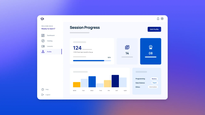
- Screen structure and layouts: Web apps and websites have pages; mobile apps have app screens, or views. Views display your app’s design or content. Typically, you’ll use elements like headers, content blocks, and columns / grids to display content in a visually appealing and easy-to-navigate way. Good screen structure aids navigation, scanability, and visual hierarchy to make your app easy to use.
- Navigation patterns: Navigating an app on mobile — usually via touch — incorporates different elements than web-based design. Tab bars, stack navigation, and even sheets are all key elements to get familiar with and use in your designs. Intuitive navigation supports usability and user satisfaction with your app.
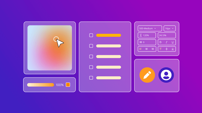
- UI components: These visual components display on screens in your app and help users use and navigate your app. These include reusable elements like buttons, form fields, sliders, toggles, cards, icons, and lists.
- Touch gestures: Gestures like tapping, swiping, dragging, pinching, and others can all be used to initiate actions on mobile. For example, you might tap a button to search instead of clicking it, or pinch to zoom.
- Text hierarchy: Since mobile screens are commonly much smaller than web screens, typography and fonts are even more important. Font size, weight, line spacing, and content grouping can help you establish visual flow and emphasize the most important content. This helps users find just what they need in your app and makes it feel intuitive.
- Color and contrast: As with all design, color can set a mood, draw attention, and provide intuitive functionality (i.e., a red button for “cancel” and a green button for “go”). Contrast is even more important on mobile as well for accessibility. Higher contrast makes it easier to navigate for those using assistive devices.
- System responses and feedback: When designing an app, don’t forget “in-between” states like loading states and indicators, pressed states, transitions, error states, and validation messages. Doing these well helps users understand how the app works and gives them clarity and confidence when using your app.
- Microinteractions: These are subtle animations or effects related to minor actions, such as a small vibration or haptic feedback when a toggle is switched on or off, or a screen animation such as the color of a heart icon changing when it is clicked.
Mobile app design principles and best practices
Of course, while some classic design rules are foundational across any platform (i.e., white space, rule of thirds), these mobile design principles are essential to learn before you start designing.
| Principle | Why it matters | Example |
|---|---|---|
| Functionality | Web apps include more complex functionality, such as allowing users to log in, send messages, edit data, and so on. | Websites tend to use static pages, where visitors consume content but can't add to or edit it. |
| Keep it simple and focused | Mobile screens are small, and users are often distracted when they’re using them. Less is more: it’s easier for users to reach their goals when there aren’t non-essential elements on the screen. | Limit each screen to one core purpose, and use white space to keep screens uncluttered. |
| Be consistent | Consistent styles, colors, components, and interactions or gestures build familiarity and help make your app intuitive to use. | Clickable buttons should be the same color. Gestures should be consistent (i.e., you shouldn’t have to tap once on some buttons and tap twice on others), etc. |
| Follow familiar design patterns | Sticking to familiar design patterns helps users intuitively understand and navigate your app. | “Yes” buttons on the left, “no” buttons on the right; primary buttons or elements have a visual hierarchy and are easy to find, etc. |
| Design with mobile gestures in mind | Optimize for the types of interactions that feel most natural on mobile to make your app simple to use. | Users should be able to navigate the app with thumbs or a single finger, use minimal typing, and be able to tap and swipe rather than click and drag. Key buttons and elements should be “easy to reach” with a single finger when holding the mobile device. |
| Optimize for performance | Users expect mobile apps to be fast and seamless. Lightweight and responsive designs ensure your app works in real-time without lagging. | Minimize load times and resource-heavy elements in your design. Reduce visual clutter or unnecessary animations to speed up your app. |
| Plan for change | A flexible design is a future-proof design. As mobile devices and app expectations change, a flexible design can evolve easily based on user feedback and new features. | Keep your designs simple, use reusable components, and set up universal styles so you can easily adjust elements across your entire app as needed. |
How to design a mobile app: 7 steps
Traditionally, designing and building native mobile apps happened in two separate processes and tools. On Bubble, these two processes are closer than ever. However, it helps to have a solid overview of the mobile app design process, so that’s what we’ll focus on here — even though tools like Bubble can speed up these processes significantly and make some of these steps redundant.
Step 1: Start with user research and market analysis
If you’re just vibe coding an app for yourself, then diving right into designing and building the features you know you want is no problem. But if you’re looking to build and scale an app for end-users — that is, a real business, not just an app — then the mobile app design process needs to start at the end, with the user.
User and market research is simple, but not easy. You should be able to define:
- Who your target users are: What roles, demographics, or problems identify your core user? What are their main goals, problems, frustrations, or pain points? Looking at online forums and social media threads can give you real insight into user personas and needs.
- How your app solves their pain points: Most users will already have a solution to their problem — how does your app solve it better, easier, faster, cheaper, or something else?
- Analyze competing apps: It’ll be tough to build “the next Uber” if you’re not super familiar with the original one. Download other apps in your space. Map out their flows, navigation patterns, screens, and visual hierarchy. What works? What doesn’t? What do users complain about? (Check online, and check the reviews.) How can yours be better?
- Look for patterns and gaps: Sometimes it makes sense to zig where others zag, but sometimes, things are done the way they are for a reason. Look for patterns in the user interface that make sense to adhere to as well as unaddressed needs that could set your app design apart.
Step 2: Define app structure and user flows
With your research in mind, you need to define how your app will be structured (i.e., what will be included, features, and screens) and how users will move through it (i.e., navigation, workflows, and user journeys).
The easiest way to do this is to split it into two parts:
- First, define key user tasks: What are users going to hope to achieve in your app? What specific tasks will they do? This can include things like signing up for an account, doing a search, booking or buying something, sending messages, adding an item to a to-do list, etc.
- Then, map out core user journeys: What steps will the user need to take from the entry point to their goal? For example, to sign up for an account, they may need to download the app, find the sign up screen, fill in a form, confirm their email, etc. At this stage, focus on the logic and steps, not the visual design.
You can then build the structure and user flows of your app based on key tasks.
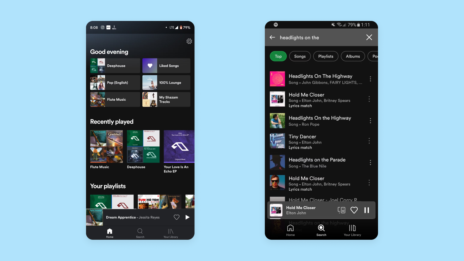
For example, core tasks on an app like Spotify might be listening to music (or other audio) and finding new music. As such, they have three core views that support those: Home (listening to music and finding new music), Search (finding new music), and Your Library (listening to music).
From there, you can begin to sketch out other views, actions, and navigation needed to complete those tasks. Whenever possible, avoid unnecessary steps and simplify flows — the fewer decisions and actions a user has to take to achieve their goals, the better.
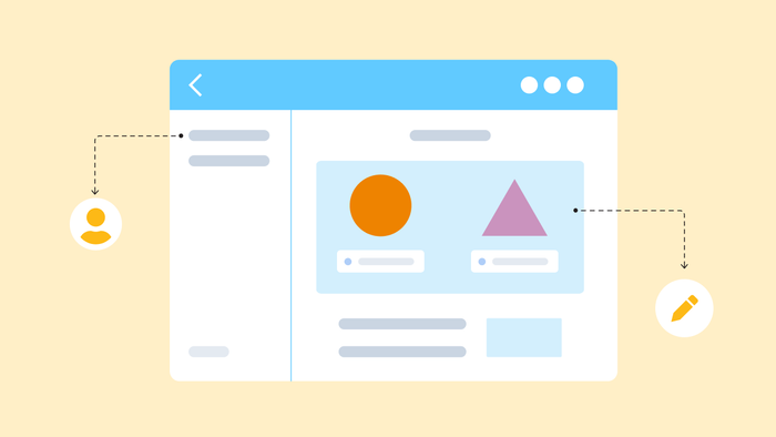
Step 3: Plan the layout with wireframes
Wireframes are a great way to create low-fidelity (read: quick and dirty) sketches that help you map out design without committing too many resources to it too soon. They’re key to helping you figure out user flows and key elements, and catch usability issues or gaps early on, when they’re still easy to fix.
Missy Kelley, head of product design at Bubble, highlights how wireframing is less about visuals and more about the core problems your app is solving:
“What information does my product need? What data should it capture? What is the pacing of the story I’m trying to tell? Wireframes help answer these questions quickly, ensuring you focus on solving the right problem rather than getting caught up in design or copy.”
A good wireframe:
- Identifies individual screens and views needed
- Sketches out individual screens and elements based on user flow (i.e. buttons, inputs, navigation bars)
- Establishes a basic visual hierarchy (i.e. headers, content blocks, images, buttons)
- Maps out basic user flows and how users will move from one screen to the next (through navigation like tab bars, buttons, and gestures)
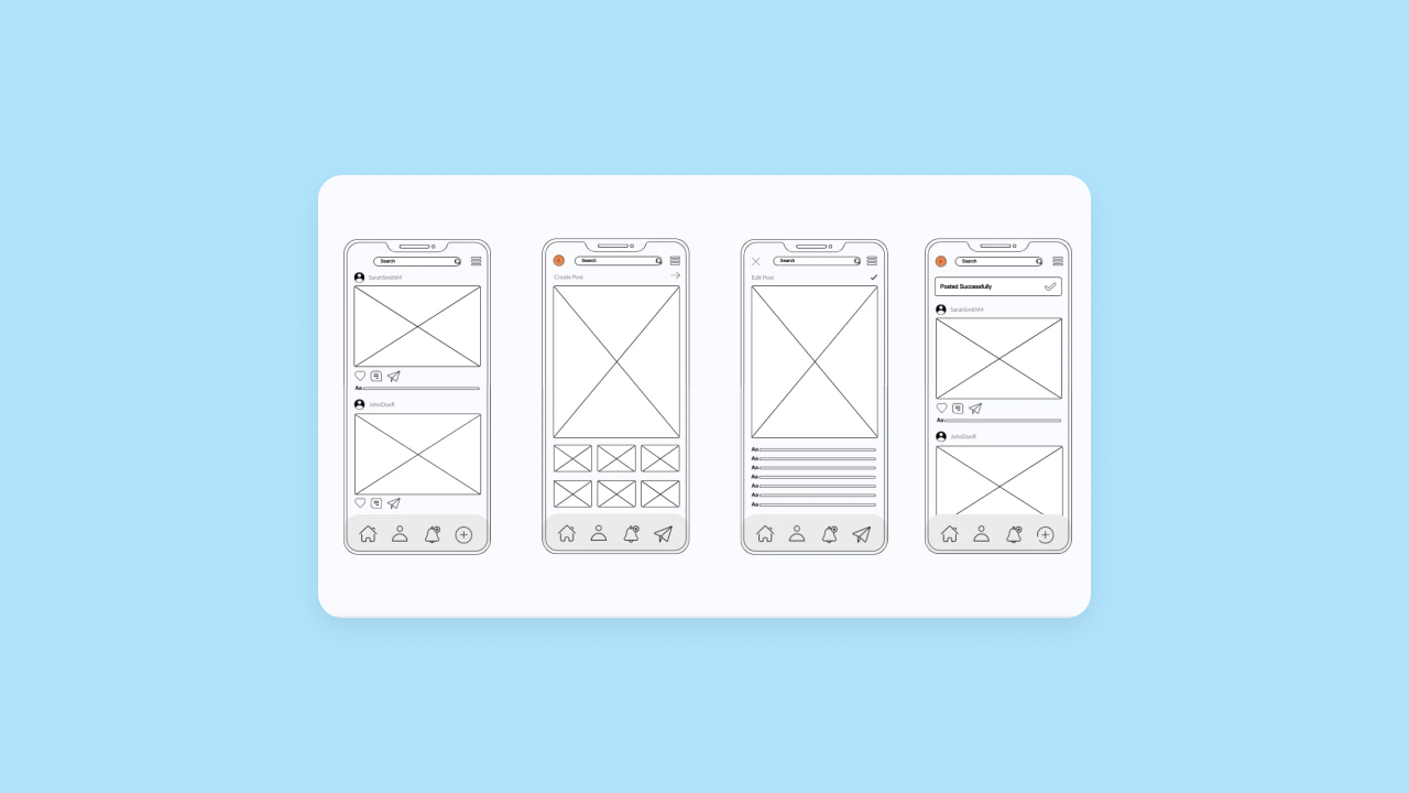
When you’re wireframing, avoid the temptation to go too detailed too soon. The goal here is to think big-picture. Another mistake to avoid: don’t try to reinvent the wheel in your early designs. Common layouts and patterns like cards, tabs, and sheets make it easier to wireframe, and offer better usability for your end-users.
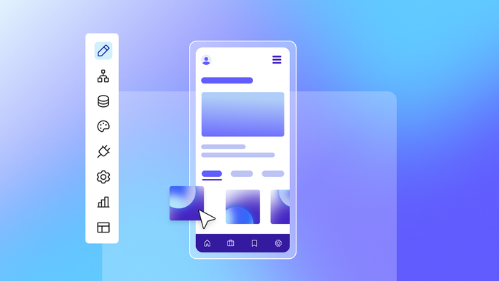
Step 4: Craft the visual UI design
Once you feel confident about the function of your wireframe, it’s time to dial in the form.
UI design focuses on the visual elements of your app, prioritizing appealing, on-brand pages and screens and making intentional decisions about things like colors, fonts, styles, and alignment.
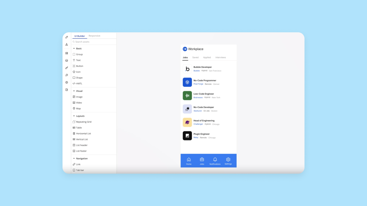
On Bubble, you get all of the common mobile UI elements out of the box as native elements.
Sheets for native popups; selectable, horizontal, and short lists for displaying fixed amount of data; and specialized view styles like vertical or section lists for large amounts of data are all specifically designed for mobile to make an app that feels 100% native without being locked into a template or having to design everything from scratch.
Here’s what you want to be thinking about at this stage:
✅ Visual identity: How do you distinguish your brand? Brand colors, fonts, logos, and a cohesive design language reflect your product and brand personality and show your audience “we’re the tool for you.”
On Bubble, you can make UI design a lot easier with styles — a pre-set visual identity that keeps things consistent across your app. For example, you might set a default font for all body text, or default colors for buttons or other reusable elements.
If you’re adding a native mobile app to a project with an existing web app on Bubble, Bubble automatically carries over your existing app’s styles. Otherwise, define your brand style once, then use it for both your web and mobile app on Bubble.
✅ UI elements: Think through how common, reusable elements will look, such as:
- Buttons
- Inputs and forms
- Icons
- Cards
- Headers
Visually consistent UI elements make it easier to learn and navigate your app, and clearly communicate intention and use. For example: Similarly sized or colored buttons make it easier to find what’s clickable, in the same way that blue-colored, underlined text automatically indicates a hyperlink.
Even better: If you already have a web app on Bubble, you can copy and paste many UI elements directly from your web app to your mobile app — giving you that much less to recreate.
✅ Spacing and alignment: Solidifying structure at this point helps bring detail into your wireframes for the building process, and makes it easier for the users to scan and understand the content in your app. Grid systems, padding, and white space are all foundational design principles you should use here.
✅ Platform-specific guidelines: As you design the UI for mobile apps, keep in mind the native design conventions for iOS and Android.
- For iOS, that’s Apple’s Human Interface Guidelines (HIG)
- For Android, that’s Google’s Material Design
These guidelines provide best practices for each platform around designing UI elements and actions like icons, toolbars, colors, layouts, and gestures. These guidelines are just that — guidelines, not rules — but following them will help make your user experience smoother and make the app approval process in the App Store / Google Play Store easier.
Step 5: Build interactive prototypes
Interactive app prototypes merge form and function so you — and your future users — can test out the whole experience seamlessly.
Typically, teams will use a prototyping tool to bring some functionality to designs. Tools like Figma, Softr, or Sketch let you create interactive prototypes that mimic how your app will work. For example, you can link screens to mimic user actions, add animations for buttons or other interactive elements, and map out user flows.
To speed up your production timeline, you can also use an all-in-one tool like Bubble, which allows you to make a functional, interactive app from the first design. Even better, you don’t have to rebuild your designs and prototypes into a “real app” later. You can create a simple v1 instead of working through time-consuming prototypes, MVPs, and real builds.
Either way, once you have a simple prototype in place, you’ll want to use it to test out the entire experience:
- Walk through key user flows and identify (and re-design) any steps or screens that feel clunky or hard to use.
- Share the prototype with your team, early users, or stakeholders to get feedback before committing to a build.
- Make sure the logic of your app makes sense and there aren’t any missing pieces. Does every button go somewhere? Does each element work as you’d expect it to?
On Bubble, you can start testing as you build with built-in testing tools like version control and the debugger. For example, with the debugger, you can run through any given workflow of your app to see triggers and associated actions and data.
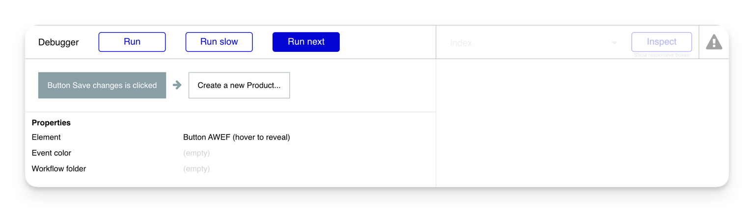
This way, you can ensure that your workflows are working as intended, with the right data, triggers, and logic. If not, you can adjust them now, before your app grows and goes to users. Not only does this save time (and resources!), it also makes your user testing more effective, as users can provide more feedback on the design and usability, without as many bugs and errors in the way.
Step 6: Test your design with real users
Bubble’s built-in testing tools make internal testing simple, but eventually, you’ll want to conduct user research with real (potential) users.
Prototype testing and usability testing allows you to validate your idea, understand what’s working and what isn’t, and identify and fix problems early on — when things are less solidified and easier to fix. Tools like BubbleGo — our native preview app — allow you to preview and use your app on a real mobile device before you ever publish it to the app stores. That way, you and your testers can get the most “real” experience to test with before going live.
There are many kinds of prototype testing, but here are the basic steps:
- Define a clear, narrow test. The best tests clarify who, what, when, where, why, and how. A narrow test gives you real data you can use to improve, compared to lots of vague, ad-hoc feedback that doesn’t necessarily tell you anything statistically significant.
- Choose your testers. Ideally, you’ll want to test with real users, or people who may be real users in your core target audience. Getting real feedback from users is much more valuable than feedback from team members or stakeholders.
- Choose a testing method and tool. The right testing methods and tools depend on what you’re testing and what you want to learn. For example, are you trying to understand the usability of your app? Or do you want to test which copy will perform best to guide your users to the right actions? Two very different tests, which require different tools. Use a plugin to integrate testing tools directly into your Bubble dashboard and make user testing easier.
- Look for patterns. Look at what your users do, not just what they say. If they say the design is intuitive, but many users are struggling to find a button, or clicking on the wrong thing, that’s a pattern that indicates the design isn’t as easy as it should be. Focus on recurring points of confusion, not one-off feedback.
- Evaluate and iterate. Analyze your findings and prioritize feedback based on level of concern (i.e., how problematic is this issue?) and size of audience (i.e., how many people encountered this problem?). Refine your workflows, designs, and layout to remove friction and make your app more intuitive.
Step 7: Handoff to development (or finish the app yourself)
At this point in the traditional design process, you’d prepare your design to be handed off to a team of mobile app developers for the real build. This typically includes:
- Packaging Figma files for handoff
- Solidifying design specs and image assets
- Writing interaction notes for workflows and actions
- Annotating designs with behavior details
- Communicating mobile-specific design considerations (i.e. use of gestures vs. web-based navigation)
However, this traditional phased-development process is a long one, and today’s startups don’t always have the luxury of time and resources needed for it. And besides: Why move slower when you could move faster?
If you’ve been building on Bubble and you’ve gotten to this step, you don’t need to handoff — your design is already fully functional and ready for launch. And launching your app to the Apple App Store and Google Play Stores truly couldn’t be easier — it’s one click to submit and Bubble automatically packages everything up for submission and app store approval for you. It’s so streamlined, you don’t even need a Mac to submit to the Apple App Store!
Design and build your app on Bubble
Traditionally, native mobile apps have been a huge hurdle for startups and small teams due to the tedious and time-consuming process needed to create them.
Bubble streamlines and simplifies mobile app design and development by combining them into one step — and allowing you to do it all without code. On Bubble, you get a full-stack, no-code platform to make production-ready apps where you can create UI and add logic, workflows, and databases, all in one place, and without code. That way, you can take your app from concept to launch without needing a whole team on your side.
- Instead of needing separate wireframing, design, and prototyping tools, you can do it all on Bubble.
- Bubble’s mobile design tools help you design layouts and UI for mobile that follow Apple and Google Design guidelines.
- Full control over your design, without code, allows you to achieve your vision perfectly.
- Styles and reusable UI elements help you build cohesive, intuitive designs faster.
- All-in-one design and development let you create fully-functional and interactive apps from day one. Faster timelines, fewer steps, and you don’t have to code (or hire someone who can).
- Internal testing tools and user testing plugins make it simple to share and test your app before it goes live.
If you’re looking for a simple, streamlined way to design and build your app, all in one place — without the long or expensive development needs — give Bubble a try.
Build for as long as you want on the Free plan. Only upgrade when you're ready to launch.
Join Bubble